What Are the Benefits of Custom Interior Signage for Your Business?
Custom signs made specifically for your business help promote your brand and create awareness of your products or services. Unlike standard, generic signs, they allow business owners to express themselves in unique ways through graphics, colors, and designs.
What Are the Types of Interior Signage?
Businesses commonly use five different types of interior signs, these include:
Directional (or Wayfaring)
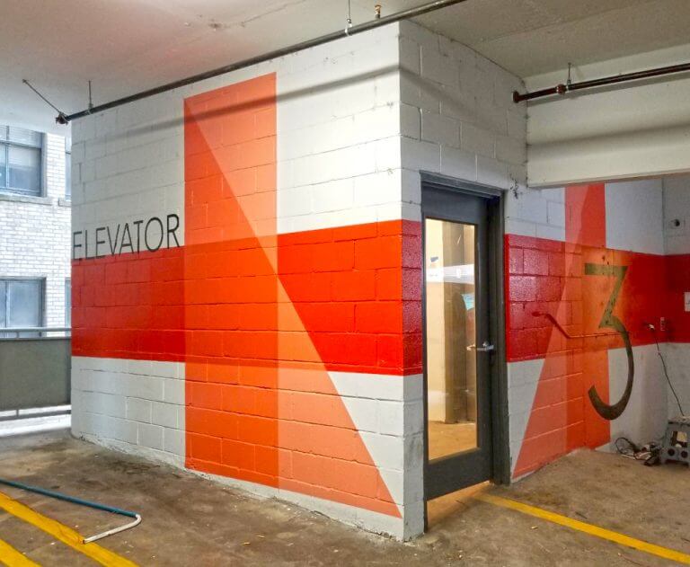
Directional signs direct people to different places like restrooms, exits, and different product aisles or sections inside a business
Lobby
This type of sign greets people as they come into the business’ front door. They typically have the name of the business and its logo.
Promotional Banners
Promotional banners are used to boost interest in a product or announce a sale. They typically can be found around door entries, escalators or around the checkout area.
Digital
Digital signs and displays can feature commercials and infographics to capture the attention of visitors and clients.
Wall Signs and Graphics
Wall signs are often used to tell the story of the company through pictures and words and help improve the aesthetics of the interior.
What Kinds of Interior Signage Do You Need?
At the very least, you’ll need signs to direct people to different places in the building such as the restrooms, office areas, checkouts and exits. You also have to post any signs required by local regulatory agencies such as the health or fire departments.
What Are the Key Elements of Signage?
The purpose of a sign is to stand out and grab people’s attention so they read it and respond to its message. In order to create a design that accomplishes this, the sign needs at least the following:
- Excellent contrast between tones and colors. You want the words or designs to stick out from the background. To accomplish this, there have to be significant differences between background color and tones and the colors and tones used to create the words or designs.
- Bright and shiny colors. Bright colors catch the eye quickly and can readily grab a person’s attention.
- Use different fonts and sizes. The use of different fonts and sizes helps for easy reading and segmenting of the different parts of the message so each part stands out.
- Leave a lot of negative space. The negative space is part of the background and helps the other elements of the sign stand out. Not enough negative space can lead to the cramming of the words and designs which makes the sign hard to read and understand.
- Leave space around the letters. Increased space around the letters helps to distinguish each one which makes them easier to read.
Williams Sign Company is here to help make your business shine in comparison to your competitors. Contact us today to get started!
